
Design Concept
A settlement-advisory concept that combines a gold monogram, deep navy, plum accents, and conversational portrait imagery.
Website design, Brand identity, UI/UX concept
01 / THE BRIEF
Balance a formal identity with an accessible introduction.
Present the service direction through recognizable people, clear categories, and a consistent contact language.
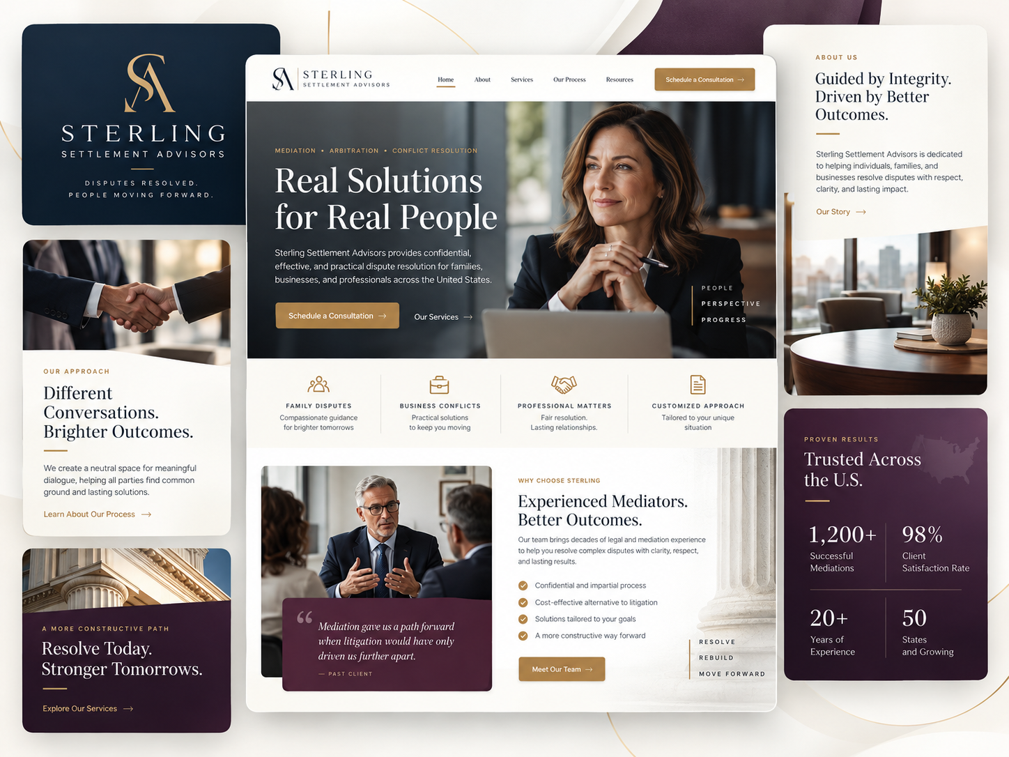
The Sterling board pairs a formal SA monogram with a portrait-led homepage. Family, business, professional, and custom-service categories sit directly below the opening. Supporting approach and about panels give the concept room to explain its tone, while plum sections introduce an additional layer of contrast within the navy-and-gold system.
- Project
- Sterling Settlement Advisors
- Focus
- Website design, Brand identity, UI/UX concept
- Industry
- Dispute resolution / Mediation and settlement
- Project type
- Design Concept
Design Concept only. No client relationship, endorsement, or performance results are represented. Text within the supplied mockups is illustrative, not verified firm information.
02 / THE DESIGN DIRECTION
Gold emphasis, navy structure, and a plum counterpoint.
A restrained accent system connects the polished identity to the warmer human imagery. Ivory sections hold the longer explanations.
01
Lead with a person
The portrait makes the first impression conversational while the typography remains formal.
02
Give categories clear roles
Four compact service entries distinguish different dispute contexts beneath the hero.
03
Use plum selectively
Plum panels punctuate the broader navy-and-ivory system without competing with gold actions.
03 / THE WEBSITE
A formal brand with a people-focused homepage.
The central layout pairs a portrait introduction with service categories and a supporting mediator composition.
INFORMATION & NAVIGATION
An approach panel that changes the pace.
The handshake image and spacious explanatory copy create a quieter supporting view. A fine gold line and restrained link echo the main identity without repeating the hero composition.
- Gold actions repeat across the light and dark surfaces.
- Human imagery connects the introductory and approach panels.
- Serif headlines and spaced labels establish separate levels of information.
04 / VISUAL IDENTITY
A polished monogram, with softer supporting surfaces.
The gold SA mark sits on navy, while the about panel introduces ivory and warm office imagery. These choices connect a formal signature to a more approachable page atmosphere.
05 / DESIGN APPROACH
Reconcile the formal and conversational elements.
The study’s objectives center on keeping the identity composed while making the service information easy to approach.
01 / ORGANIZE
Set the first impression
Balance the portrait with a prominent headline and a visible gold contact action.
02 / COMPOSE
Clarify the service groupings
Give the four dispute contexts concise labels and consistent icons.
03 / REFINE
Carry the contrast through the page
Use plum as a supporting surface and retain the same gold action language throughout.
THE DESIGN INTENT
A formal identity can still feel approachable.
Sterling connects its gold-and-navy signature to portrait and conversation imagery. The varied surfaces provide rhythm, while consistent service labels and actions keep the information anchored.
HAVE A PROJECT IN MIND?
Let’s make your next project count.
Tell us what you’re building and where you want to take it.