
Design Concept
A mediation concept that brings together a redwood identity, warm ivory surfaces, burgundy actions, and an empathetic portrait-led introduction.
Website design, Brand identity, UI/UX concept
01 / THE BRIEF
Make a difficult first step feel approachable.
Introduce mediation with clear choices and an understandable process.
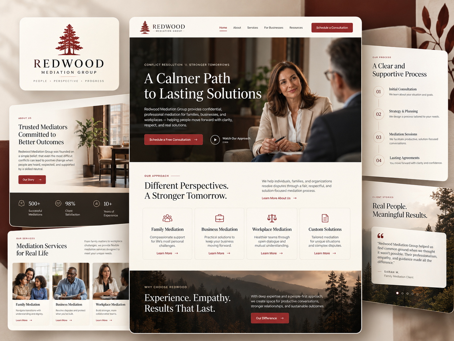
The Redwood board explores a people-centered mediation experience. A tree symbol gives the identity a grounded character, while a conversational portrait anchors the homepage. Family, business, workplace, and custom-service modules organize the offering. A numbered process panel turns an abstract service into a sequence visitors can scan.
- Project
- Redwood Mediation Group
- Focus
- Website design, Brand identity, UI/UX concept
- Industry
- Mediation / Families, businesses, and workplaces.
- Project type
- Design Concept
Design Concept only. No client relationship, endorsement, or performance results are represented. Text within the supplied mockups is illustrative, not verified firm information.
02 / THE DESIGN DIRECTION
Warmth with a clear structure.
Ivory backgrounds, dark brown imagery, and restrained burgundy accents give the information a welcoming tone without reducing its hierarchy.
01
Anchor the brand in the tree
The redwood symbol and forest imagery connect the identity to stability and growth.
02
Make the service choices visible
Four distinct service cards keep family, business, workplace, and custom mediation easy to distinguish.
03
Explain the sequence
The numbered process panel provides a visual path from the first conversation through later stages.
03 / THE WEBSITE
A homepage organized around reassurance.
The central composition moves from a human introduction to service choices and an atmospheric forest closing panel.
INFORMATION & NAVIGATION
Service information with familiar situations.
The supporting service panel uses family and professional imagery to distinguish the kinds of conversations the concept addresses. A quiet grid lets each category have a clear label and its own visual context.
- The portrait sets a conversational tone.
- Burgundy actions repeat across the cream surfaces.
- The process panel uses numbered stages rather than dense paragraphs.
04 / VISUAL IDENTITY
A symbol with room to breathe.
The redwood mark, spaced wordmark, and natural imagery establish the identity. Burgundy line icons echo the mark while cream and brown surfaces extend its warm visual character.
05 / DESIGN APPROACH
Start with reassurance, then explain the options.
The design objectives connect the first impression, service structure, and process explanation rather than treating them as isolated promotional panels.
01 / ORGANIZE
Frame the introduction
Pair a concise opening message with a scene of attentive conversation.
02 / COMPOSE
Separate the service choices
Use consistent cards with specific labels for different mediation contexts.
03 / REFINE
Make the next steps legible
Keep the sequence and contact treatments clear when the content stacks on smaller screens.
THE DESIGN INTENT
A welcoming tone needs a practical path.
Redwood combines warmth with an explicit service and process structure. Its main design idea is that visitors can understand the options and the next steps without losing the human tone established by the opening portrait.
HAVE A PROJECT IN MIND?
Let’s make your next project count.
Tell us what you’re building and where you want to take it.