
Design Concept
An arbitration concept built around a geometric N monogram, warm stone imagery, charcoal contrast, and rust-colored actions.
Website design, Brand identity, UI/UX concept.
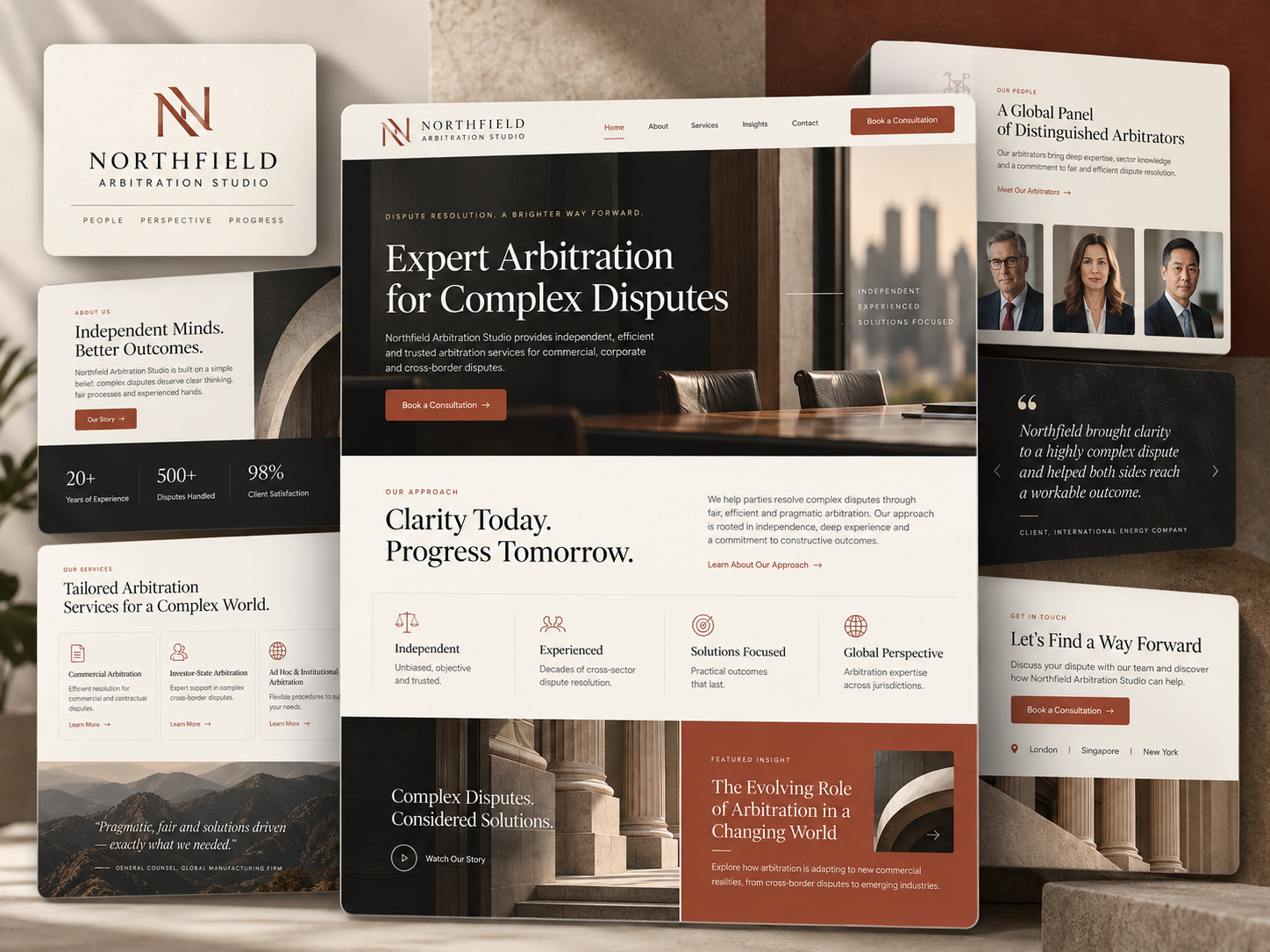
01 / THE BRIEF
Make a specialist offering easier to understand.
Create a clear relationship between arbitration services, the people involved, and supporting insight.
The Northfield board uses architecture and a boardroom setting to introduce a specialist arbitration direction. A compact monogram anchors the identity, while commercial, investor-state, and institutional service categories organize the sample offering. An arbitrator panel and editorial module extend the visual story beyond the initial service message.
- Project
- Northfield Arbitration Studio
- Focus
- Website design, Brand identity, UI/UX concept.
- Industry
- Dispute resolution / Arbitration
- Project type
- Design Concept
Design Concept only. No client relationship, endorsement, or performance results are represented. Text within the supplied mockups is illustrative, not verified firm information.
02 / THE DESIGN DIRECTION
Formal structure with warm material cues.
Stone, charcoal, ivory, and rust form a restrained palette. Architectural imagery and serif headlines provide the strongest compositional anchors.
01
Use geometry as the signature
The angled N monogram creates a compact mark that contrasts with the softer texture of the surrounding surfaces.
02
Name the specialist paths
Distinct arbitration categories clarify the scope of the sample information architecture.
03
Separate people from editorial content
A portrait panel and an architectural insight module receive different visual treatments within one system.
03 / THE WEBSITE
A specialist introduction with supporting depth.
The central composition moves from the boardroom opening to short principles and an architectural editorial section.
INFORMATION & NAVIGATION
Give the people their own panel.
The arbitrator study groups three portraits under a clear heading. Consistent framing and a simple link create a readable people-focused module beside the more atmospheric architectural compositions.
- The N monogram offers a compact identity reference.
- Rust actions remain recognizable on ivory and charcoal.
- Architectural images connect the opening and editorial sections.
04 / VISUAL IDENTITY
Geometry, stone, and rust.
The monogram panel and service study show how a spare identity can work alongside warm material textures. Rust serves as a selective accent; ivory and charcoal establish the main light-and-dark rhythm.
05 / DESIGN APPROACH
Define the specialist structure before the visual detail.
The design objectives distinguish the service paths and supporting information, then connect them through consistent geometry and contrast.
01 / ORGANIZE
Identify the service categories
Separate commercial, investor-state, and institutional information into clear modules.
02 / COMPOSE
Establish the visual frame
Use architecture and warm stone imagery to connect the boardroom opening with later sections.
03 / REFINE
Keep the supporting modules distinct
Let portraits, service summaries, and editorial material use proportions suited to their roles.
THE DESIGN INTENT
Specialization benefits from a clear visual frame.
Northfield combines a formal identity with distinct information modules. Its strongest design idea is the balance between atmospheric architectural imagery and specific service labels, giving the specialist subject both character and structure.
HAVE A PROJECT IN MIND?
Let’s make your next project count.
Tell us what you’re building and where you want to take it.