
Design Concept
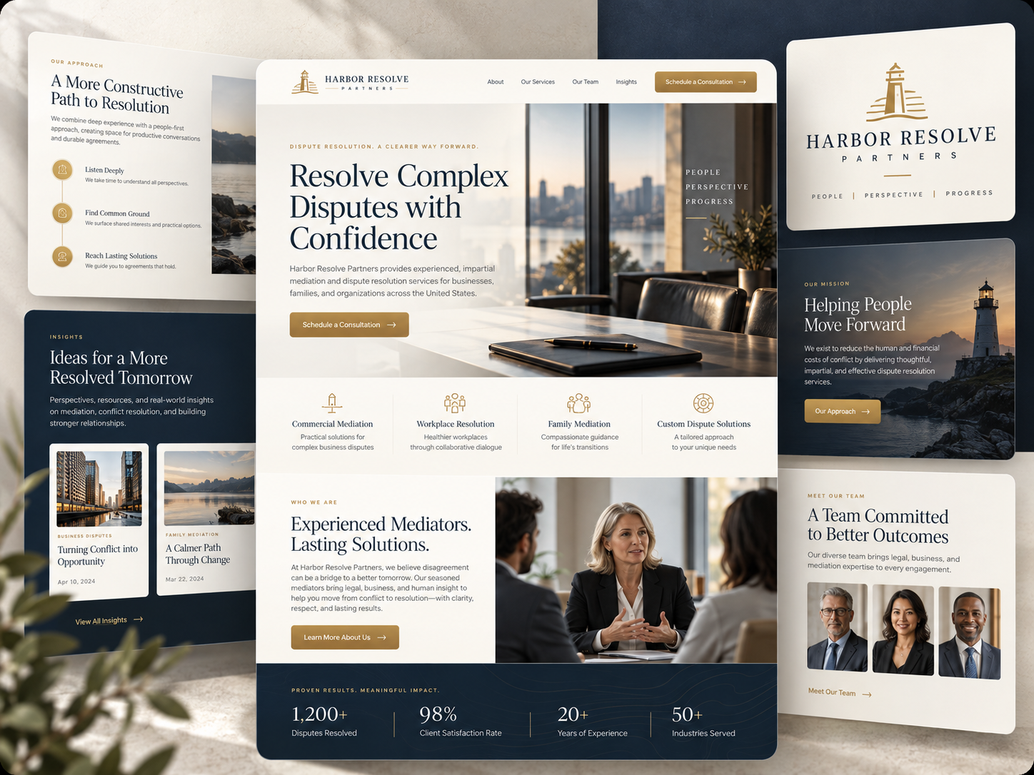
A dispute-resolution concept that pairs a lighthouse identity with navy, ivory, and gold, combining professional service information with a calm coastal visual theme.
Website design, Brand identity, UI/UX concept.
01 / THE BRIEF
Connect professional clarity with a sense of direction.
Give varied dispute-resolution services a coherent introduction and visual identity.
The Harbor Resolve board builds its identity around a lighthouse. A boardroom hero introduces the professional setting; coastal imagery carries the same idea into the mission panel. Commercial, workplace, family, and custom-service categories share one visual language. Team and editorial panels give the concept depth beyond the homepage opening.
- Project
- Harbor Resolve Partners
- Focus
- Website design, Brand identity, UI/UX concept.
- Industry
- Dispute resolution / Commercial, workplace, and family mediation
- Project type
- Design Concept
Design Concept only. No client relationship, endorsement, or performance results are represented. Text within the supplied mockups is illustrative, not verified firm information.
02 / THE DESIGN DIRECTION
A steady navy-and-gold direction.
Gold marks actions and identity details, navy holds the darker narrative panels, and ivory backgrounds give explanatory content room to read.
01
Make the symbol meaningful
The lighthouse mark and coastal images reinforce the theme of finding direction.
02
Group different service contexts
Four aligned categories distinguish commercial, workplace, family, and custom dispute information.
03
Vary the supporting material
Team portraits, approach content, and editorial previews use different scales within the same palette.
03 / THE WEBSITE
From the boardroom to the people involved.
The central layout connects a professional opening, service navigation, and a conversational people-focused section.
INFORMATION & NAVIGATION
Introduce the team without losing the calm tone.
The team panel presents three portraits on a quiet ivory surface. Its restrained heading and gold link keep the people visible while maintaining the same measured hierarchy as the service content.
- The lighthouse creates a recurring visual anchor.
- Gold actions stand apart from the explanatory text.
- Portraits and coastal imagery offer complementary human and environmental context.
04 / VISUAL IDENTITY
A landmark carried across the system.
The lighthouse symbol, navy foundation, and gold details repeat across the brand panel and approach study. Ivory surfaces soften the contrast and allow the serif headlines to remain the main typographic feature.
05 / DESIGN APPROACH
Use the identity to organize the story.
The concept’s design objectives connect the lighthouse motif to the information sequence, from service orientation to people and approach.
01 / ORGANIZE
Establish the landmark
Use the lighthouse and coastal setting as a consistent identity reference.
02 / COMPOSE
Organize the service spectrum
Keep the four service categories legible as separate entry points.
03 / REFINE
Balance expertise and accessibility
Give the professional setting and people-focused imagery equal roles in the reading sequence.
THE DESIGN INTENT
A motif works best when it connects the content.
Harbor Resolve carries its lighthouse idea through symbol, photography, and tone. The result is a coherent design direction for varied dispute information, with clear visual distinctions between services, people, and approach.
HAVE A PROJECT IN MIND?
Let’s make your next project count.
Tell us what you’re building and where you want to take it.