
Portfolio / Design Concept
Blue Oak Conflict Resolution
A grounded identity for constructive conversations.
Design Concept
A conflict-resolution concept that uses an oak symbol, muted blue-green surfaces, warm ivory, and terracotta actions to create a calm visual setting.
Website design, Brand identity, UI/UX concept.
01 / THE BRIEF
Make the service feel clear and grounded.
Connect the introductory message with practical service categories and a recognizable next step.
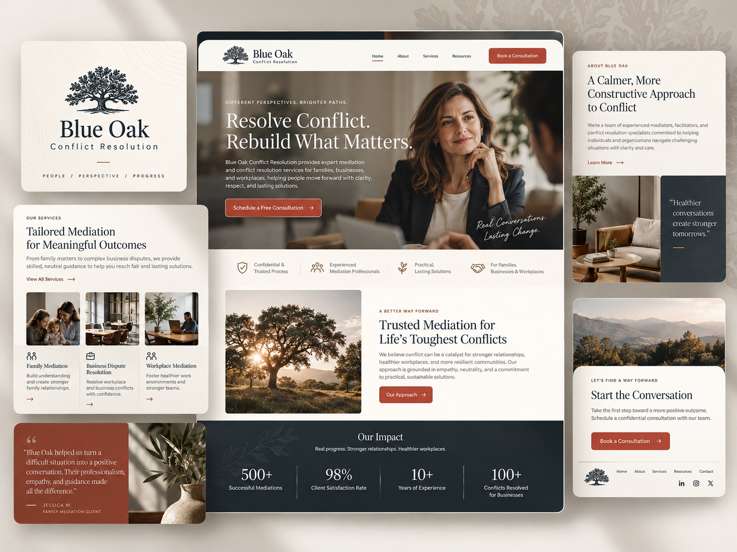
The Blue Oak board combines an oak identity with portrait and landscape imagery. Family, business, and workplace modules organize the sample services. A sunlit tree scene supports the approach section, while the closing panel simplifies the composition around a conversation-focused contact direction.
- Project
- Blue Oak Conflict Resolution
- Focus
- Website design, Brand identity, UI/UX concept.
- Industry
- Dispute resolution / Family, business, and workplace mediation
- Project type
- Design Concept
Design Concept only. No client relationship, endorsement, or performance results are represented. Text within the supplied mockups is illustrative, not verified firm information.
02 / THE DESIGN DIRECTION
Natural references with a precise accent.
Warm ivory and deep blue-green provide the main contrast. Terracotta controls mark the action points, while botanical detail carries the oak identity into supporting surfaces.
01
Carry the oak beyond the logo
Tree photography and botanical linework extend the identity into the page rather than leaving it in the header.
02
Distinguish the service situations
Family, business, and workplace imagery gives each category a recognizable context.
03
Keep the final action focused
The closing contact panel reduces the visual complexity to a clear message and one next step.
03 / THE WEBSITE
An introduction grounded in people and place.
The central homepage pairs a conversational portrait with an oak landscape and a calm sequence of supporting information.
INFORMATION & NAVIGATION
Service categories with specific visual context.
The service study uses three image-led modules to distinguish family, business, and workplace situations. Repeated labels and spacing make the categories easy to compare without overwhelming the page.
- Oak imagery connects the brand and approach content.
- Terracotta actions provide a consistent visual cue.
- A quiet closing panel gives the reading sequence a clear endpoint.
04 / VISUAL IDENTITY
A natural motif across light and dark surfaces.
The oak mark, understated botanical texture, and blue-green color direction connect the identity and approach panels. Ivory surfaces keep explanatory content light, while terracotta adds a focused action accent.
05 / DESIGN APPROACH
Connect the motif to the information sequence.
The design objectives link the oak identity, service categories, and closing conversation prompt into a coherent reading path.
01 / ORGANIZE
Ground the introduction
Pair the portrait-led message with a recognizable natural identity.
02 / COMPOSE
Separate the service contexts
Use three consistently framed modules for family, business, and workplace information.
03 / REFINE
Simplify the last step
Give the closing contact panel a short message and a distinct action treatment.
THE DESIGN INTENT
A natural identity is strongest when it supports the structure.
Blue Oak connects tree imagery and botanical details to a clear service sequence. The consistent action accent and focused closing panel give the calm atmosphere a practical direction.
HAVE A PROJECT IN MIND?
Let’s make your next project count.
Tell us what you’re building and where you want to take it.